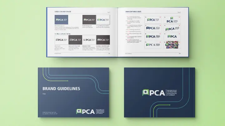
The Progressive Contractors Association (PCA) is a reputable employer association in Canada that represents contractors with a CLAC-unionized workforce. Since its inception in 2000, PCA has been a significant player in the industry. In 2023, PCA reached out to Cubicle Fugitive to create a refreshed visual brand that would better represent the association’s value proposition to its members, government stakeholders, and industry associations.
PCA collaborated with Cubicle Fugitive to design a logo that acknowledged the association’s legacy while also encapsulating its vision for the future. The chosen logo is a modern evolution of the previous one, which distinguishes the association from its competitors while signifying the value that it provides to its members and the construction industry.
PCA was delighted with the new visual brand and all its marketing collateral.The PCA brand colours consist of different shades of blues and greens, representing the growth that PCA creates for its members and the construction industry, as well as the trust and respect it has earned in the Canadian construction industry and among key stakeholder groups. The purple brand colour signifies the innovation that PCA aims to bring to the industry. The logo uses the Frutiger Bold font, inspired by modern architecture and buildings. This clean and modern sans-serif font is bold and recognizable, representing the market share that PCA has achieved and its bold approach to representing its members.
The icon is a modernized version of PCA’s previous icon; the overlapping dialogue box shapes create transparent effects that represent a common voice, collaboration, and unity, as the original icon showed.
PCA was delighted with the new visual brand, which it extended across pop-up banners, a new website, and all its marketing collateral.

